
Shares


Our Roles
Case Study
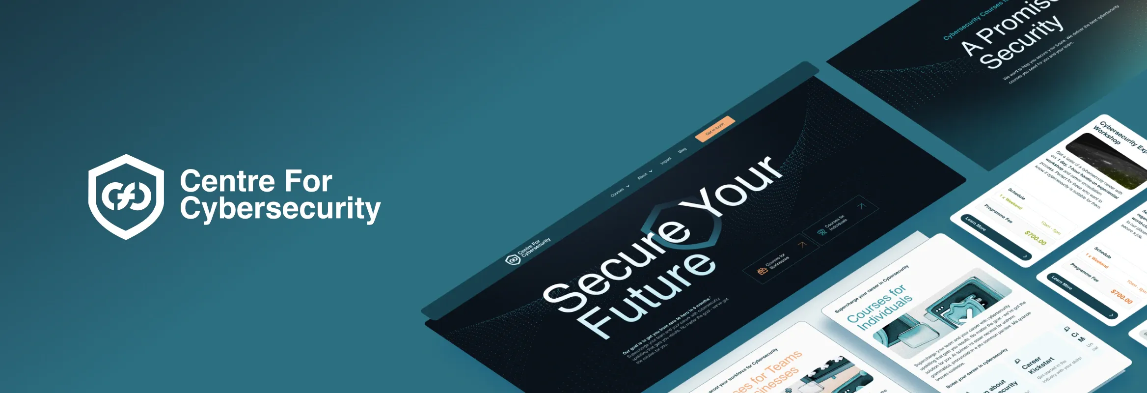
Corporate Website
UI/UX Design
Tech Stack
Webflow
Shares
Ready for your own impactful rebrand? Let's
Ready to roll? Got questions, ideas, or just want to say hi? We're all ears!

Shares
Our Roles
Tech Stack
Webflow
Shares
Ready to roll? Got questions, ideas, or just want to say hi? We're all ears!